Company Overview
The WOW Box is a good-for-you ecommerce marketplace that curates healthy, natural, toxin-free, and clean-label everyday products for modern Indian consumers.
The brand helps customers make better buying decisions by offering products that are carefully checked for harmful ingredients, while keeping them accessible, affordable, and easy to adopt in daily life.
Focused on families, health-conscious millennials, and people seeking better lifestyle choices, The WOW Box combines education, trust, and convenience through a curated product platform, ingredient awareness, and reliable delivery across Tier 1 and Tier 2 cities.
Problem
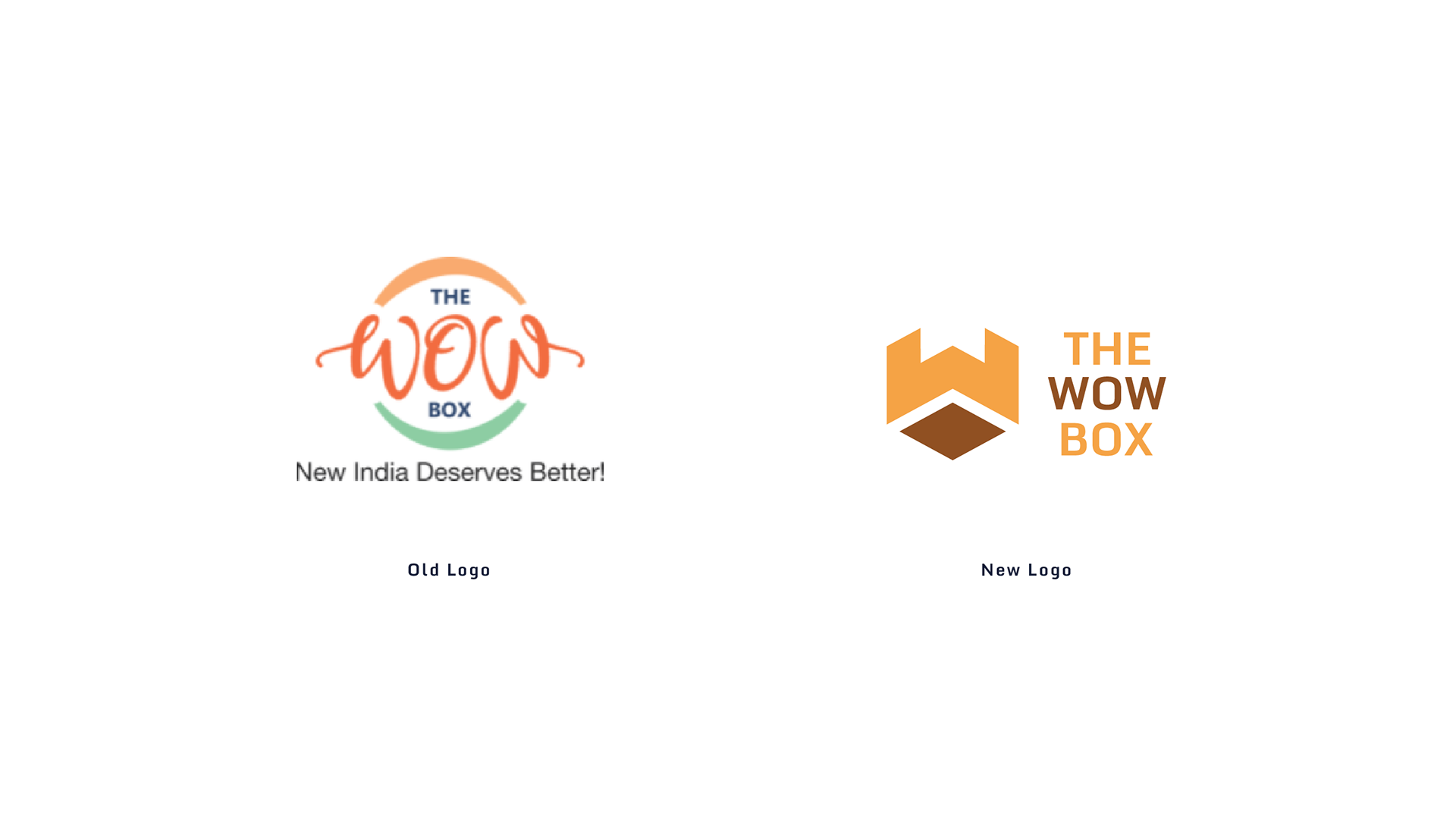
The old logo looked friendly and approachable, but it felt too casual and visually busy for a brand that wants to become a trusted ecommerce marketplace for good-for-you products. The handwritten style, multiple colors, circular elements, and tagline made it less scalable across packaging, website headers, social media, labels, and small-size applications.
It also did not strongly communicate the idea of a box, curation, delivery, or marketplace experience, which are important parts of The WOW Box brand. Since the brand focuses on healthy, natural, toxin-free, clean-label, and affordable products, the identity needed to feel more credible, organized, and trustworthy.
Solution
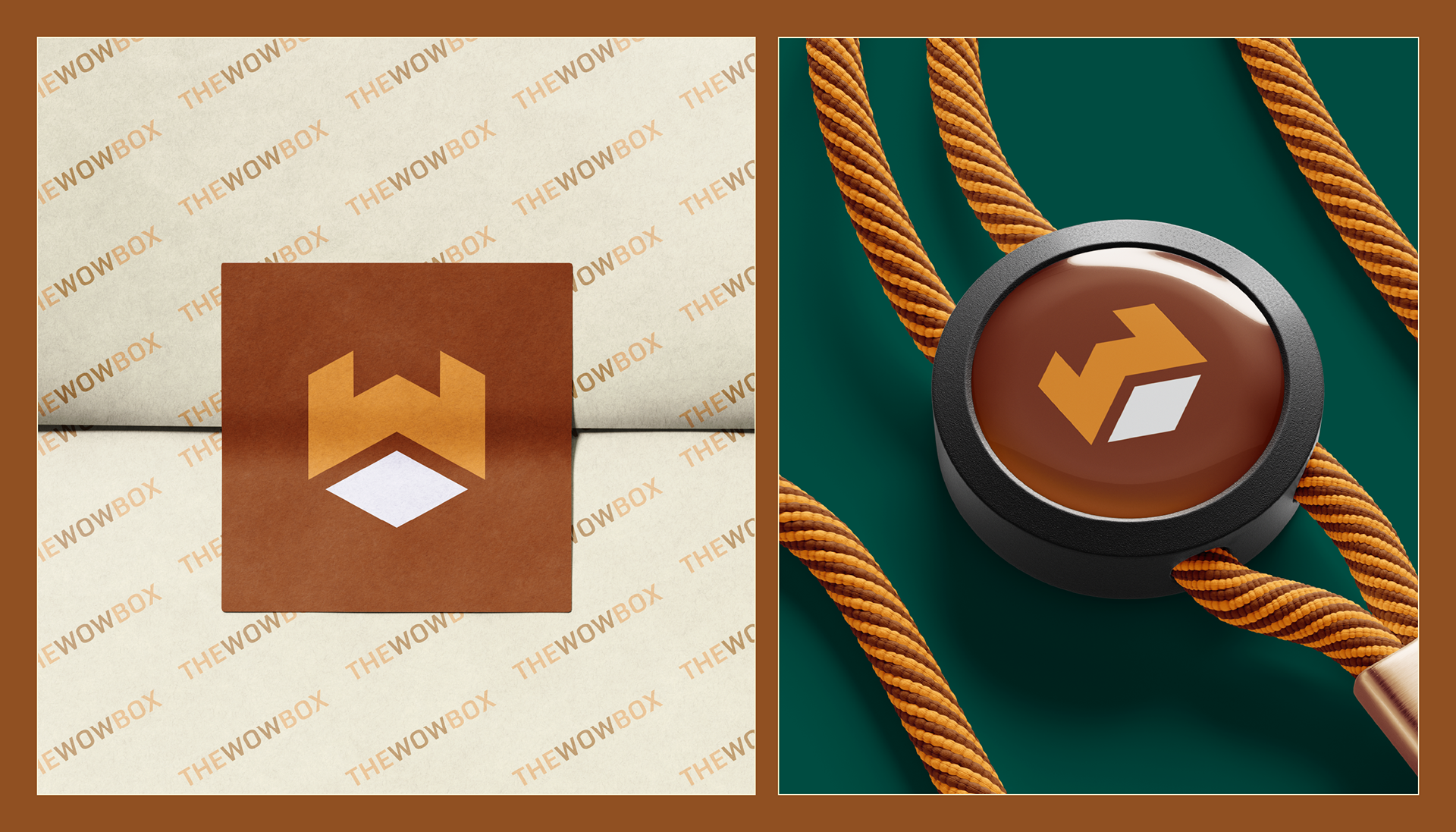
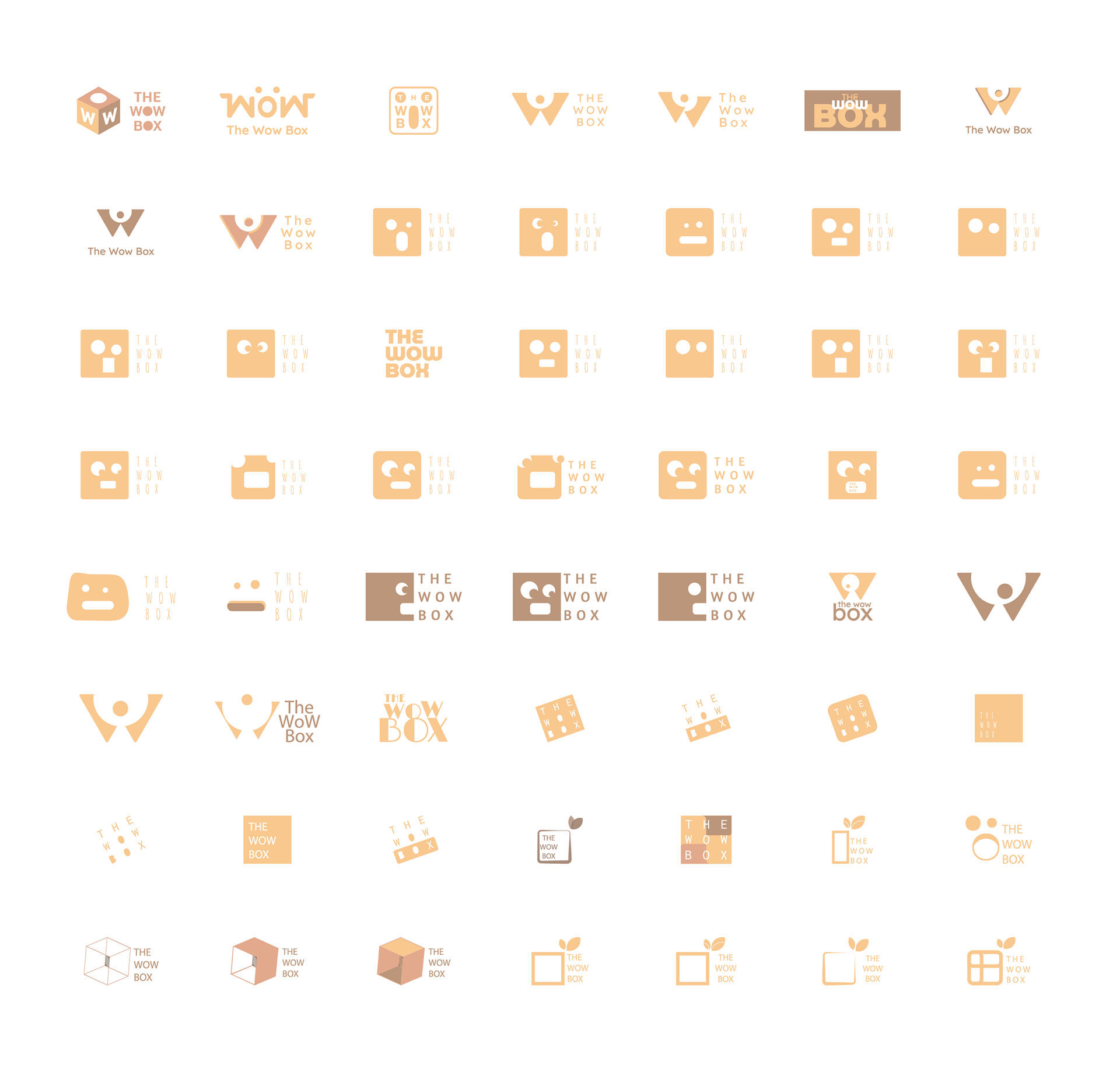
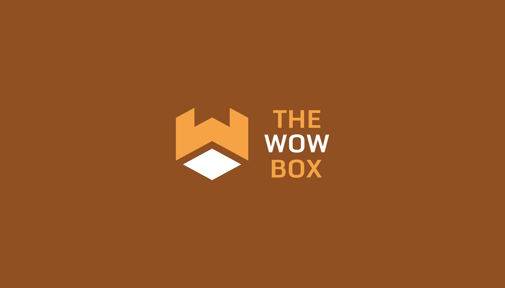
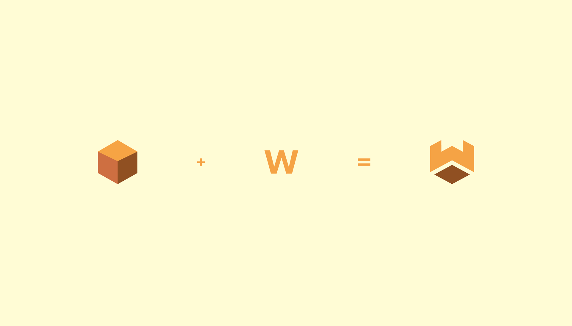
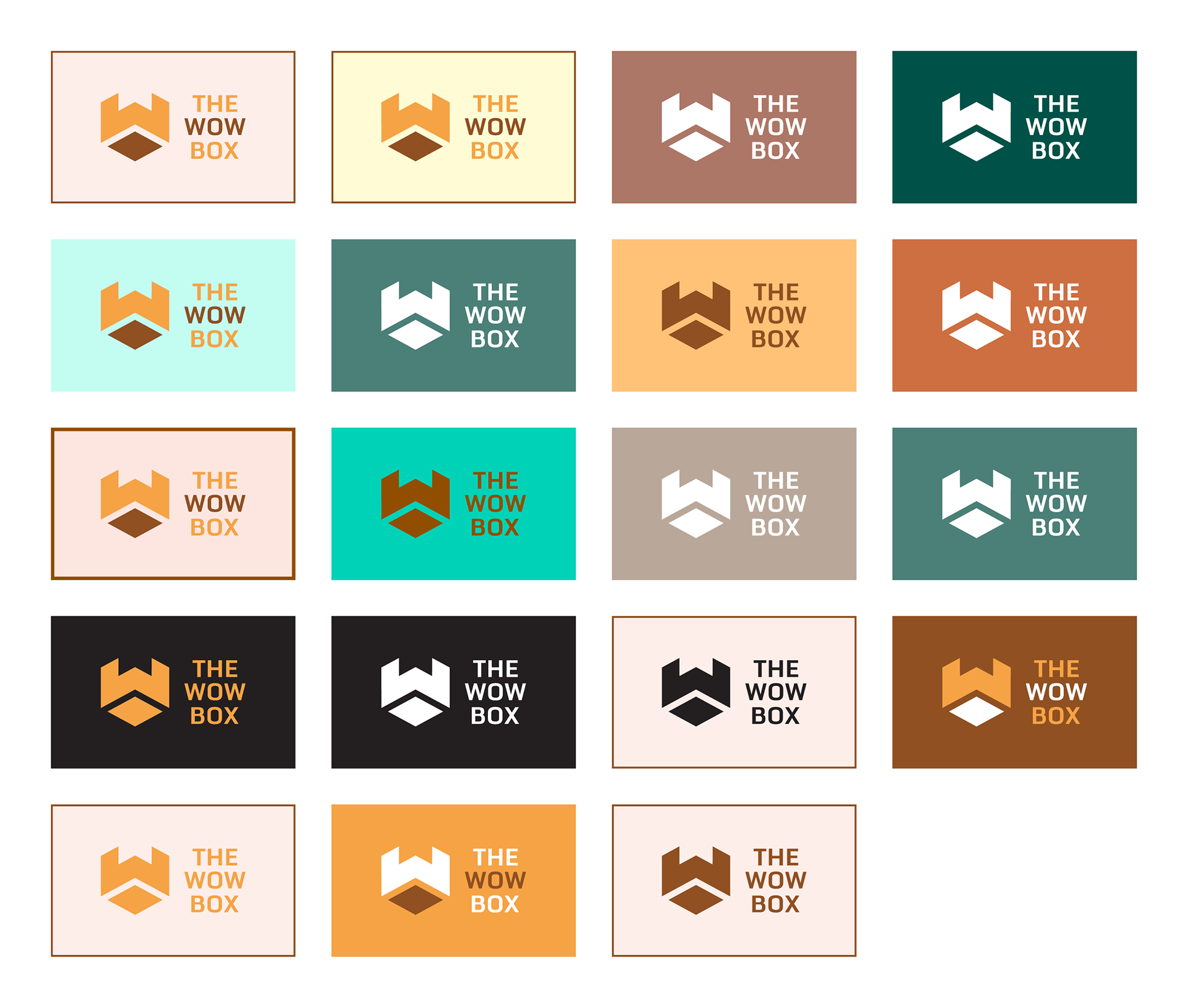
The new logo gives The WOW Box a cleaner, stronger, and more professional identity. The symbol is a smart combination of a cube/box and the letter “W”, directly connecting to the brand name The WOW Box. The cube represents packaging, curation, delivery, gifting, and discovery, while the “W” makes the mark ownable and memorable for the brand.
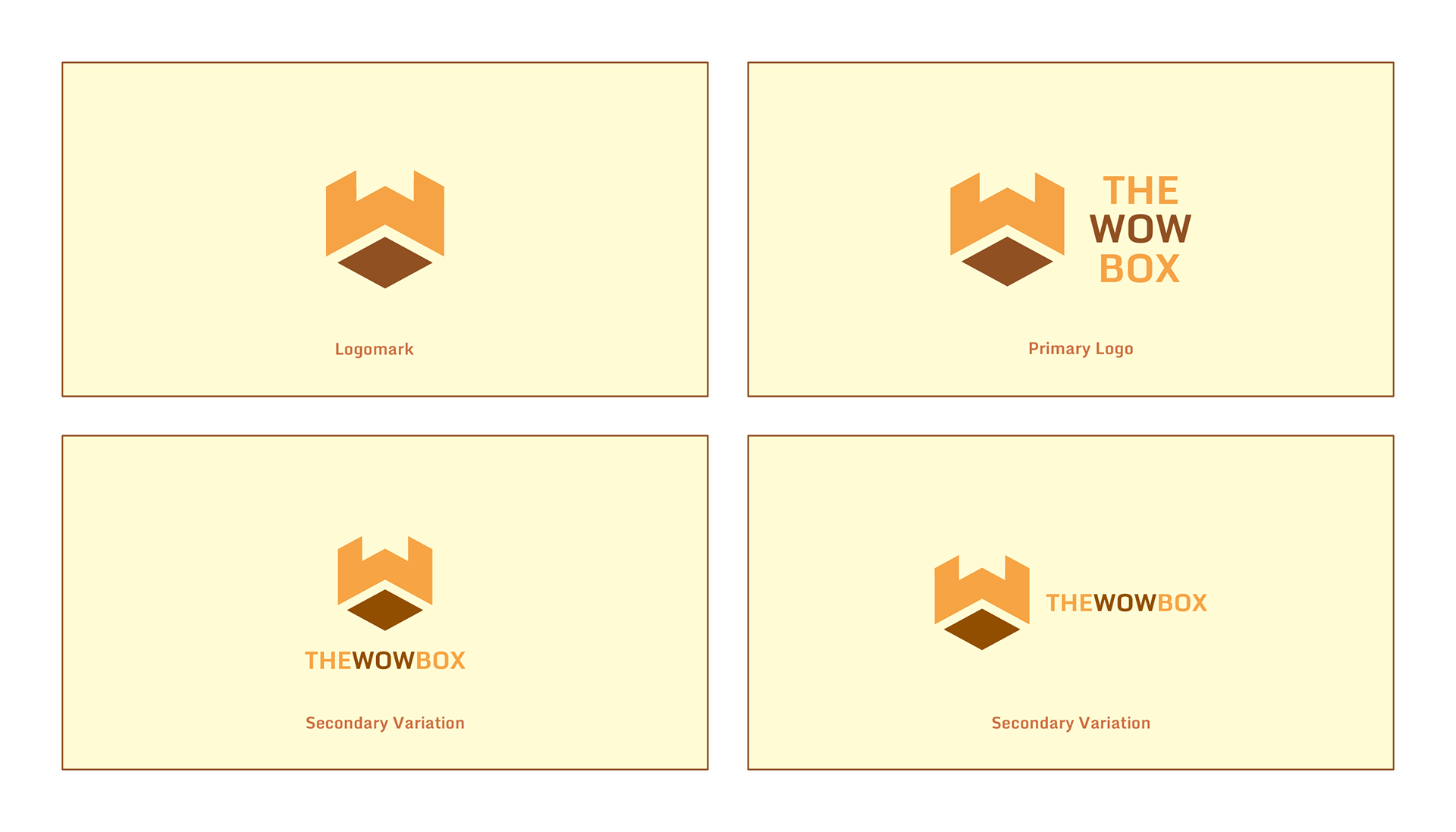
Its simple geometric form makes it more scalable, recognizable, and easier to use across digital and physical brand touchpoints. The structured mark also supports the brand’s role as a bodyguard for customers, protecting them from harmful ingredients by offering carefully checked and curated products.
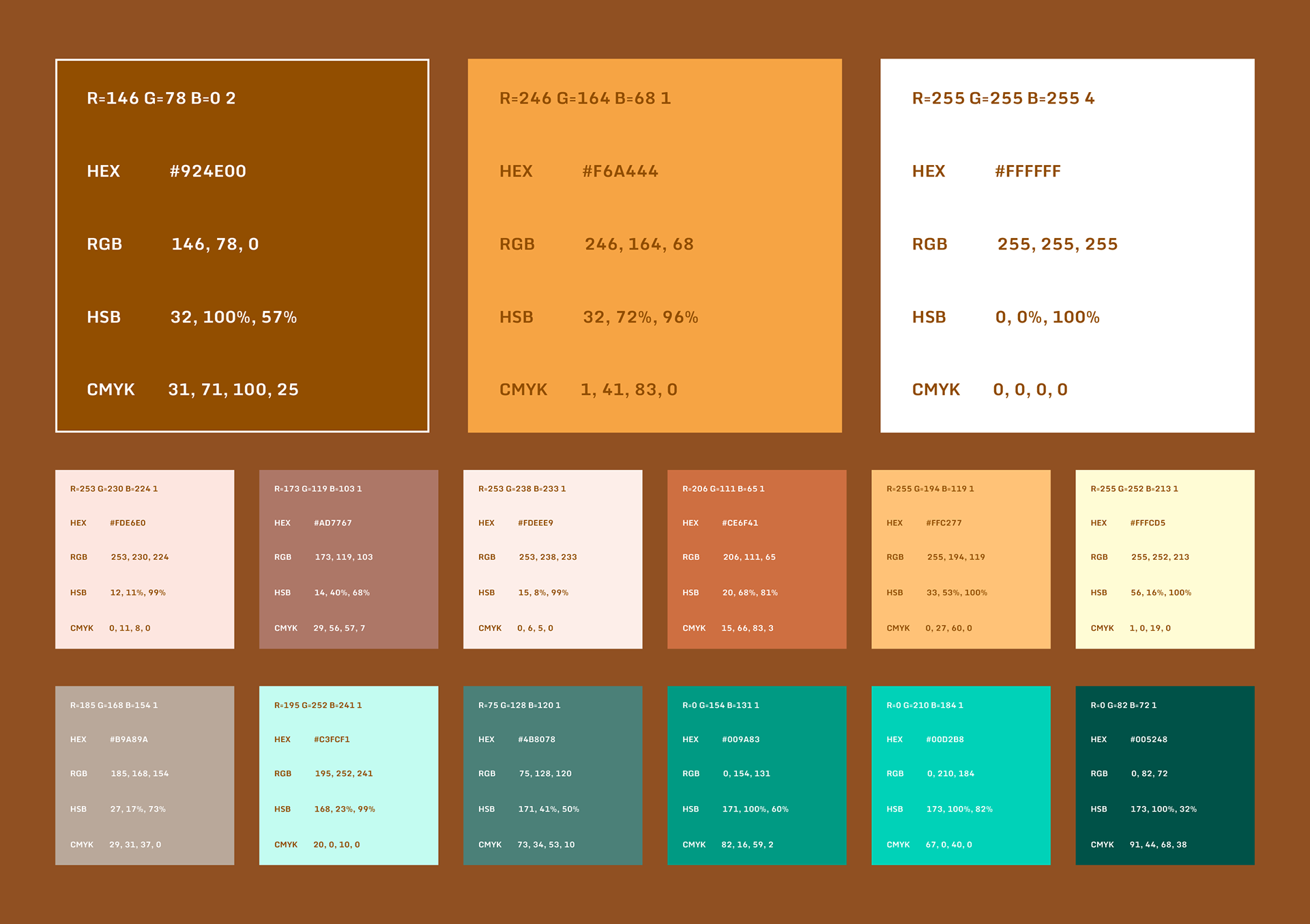
The warm orange and brown palette keeps the brand approachable while communicating energy, trust, naturalness, and everyday affordability. Overall, the new identity helps The WOW Box look like a modern, reliable, and scalable ecommerce brand for conscious Indian consumers.
In short: the new logo transforms The WOW Box from a casual-looking brand into a credible, curated, and trustworthy marketplace for good-for-you everyday products, with a distinctive symbol
that combines a cube and “W.”

My Role
As the designer, my role was to create a complete brand identity and guideline system for The WOW Box. I worked on understanding the brand’s purpose, target audience, positioning, and promise as a good-for-you ecommerce marketplace, then translated those insights into a clean, trustworthy, and scalable visual identity.
My responsibilities included:
Understanding the brand brief, audience, objectives, and market positioning
Creating the overall visual direction for the brand
Redesigning the logo with a concept that combines a cube/box and the letter “W”
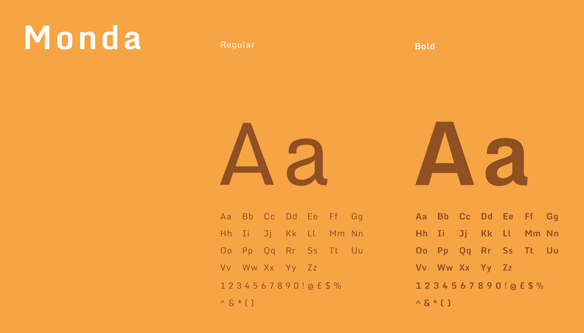
Defining the color palette, typography, and visual language
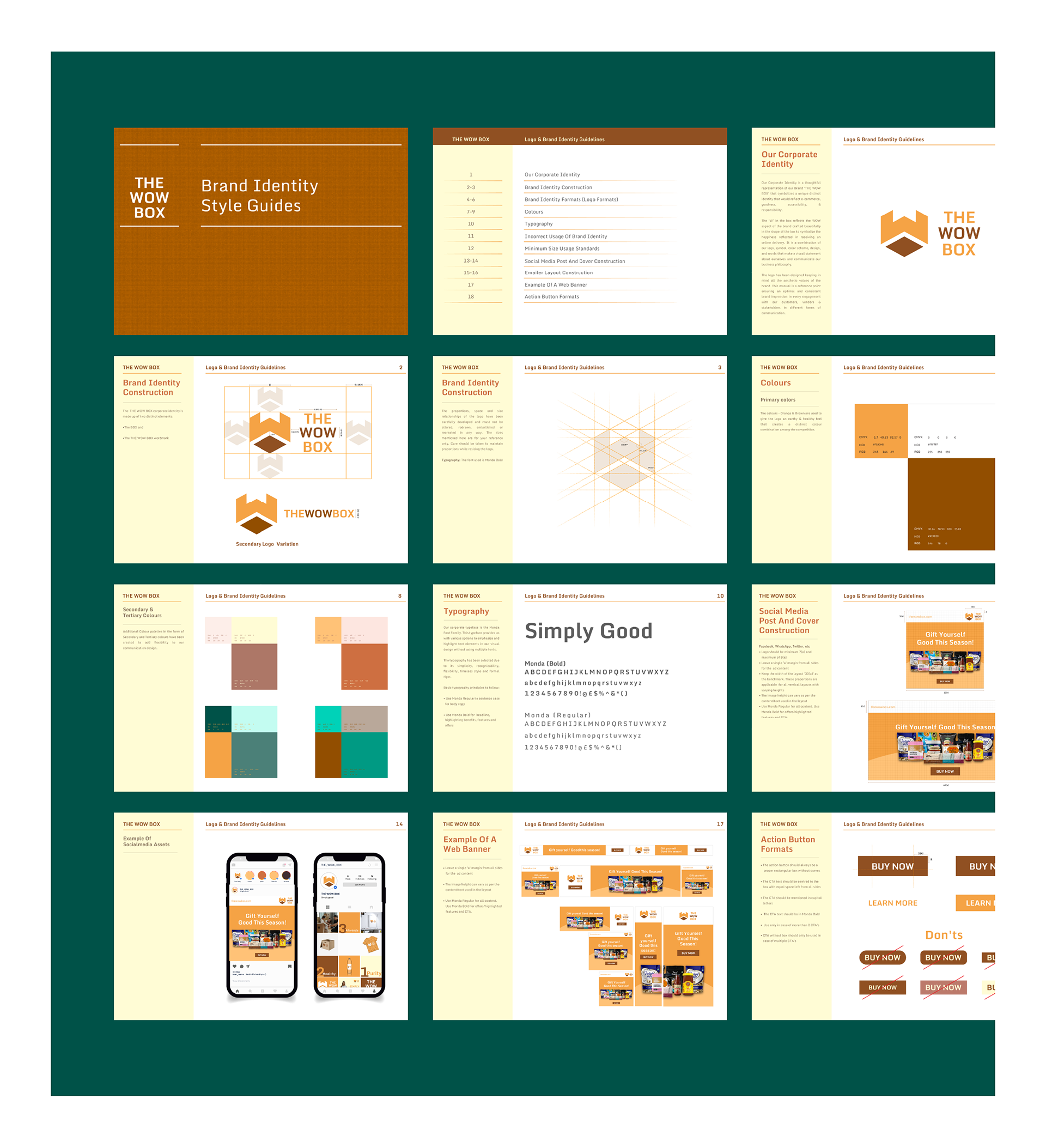
Developing a structured brand guideline system
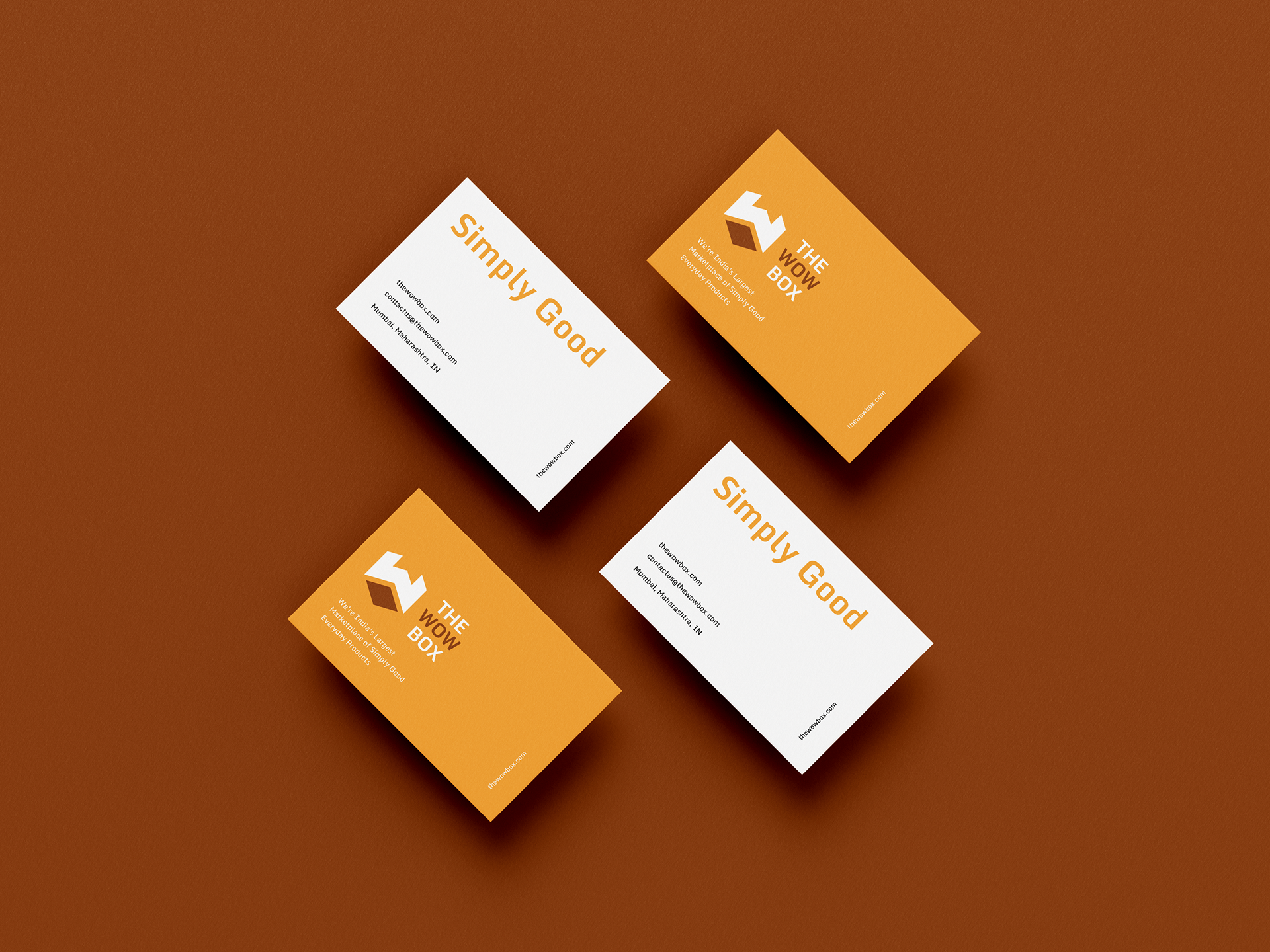
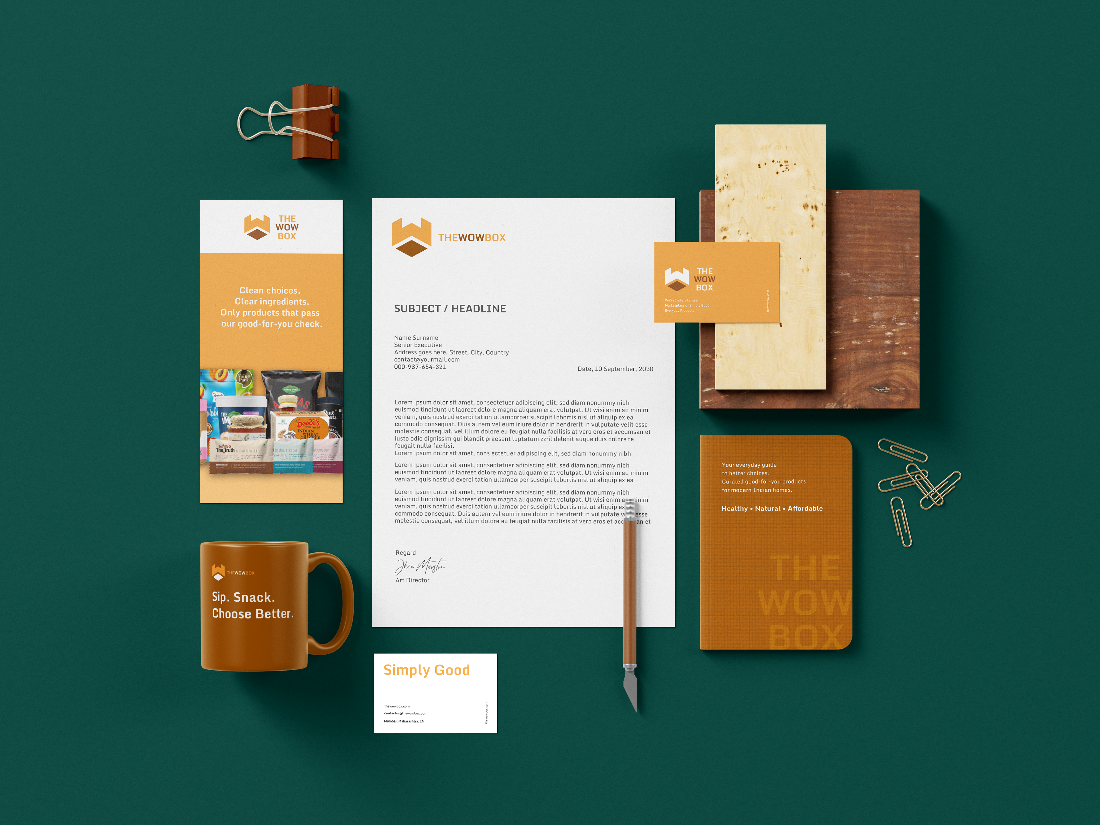
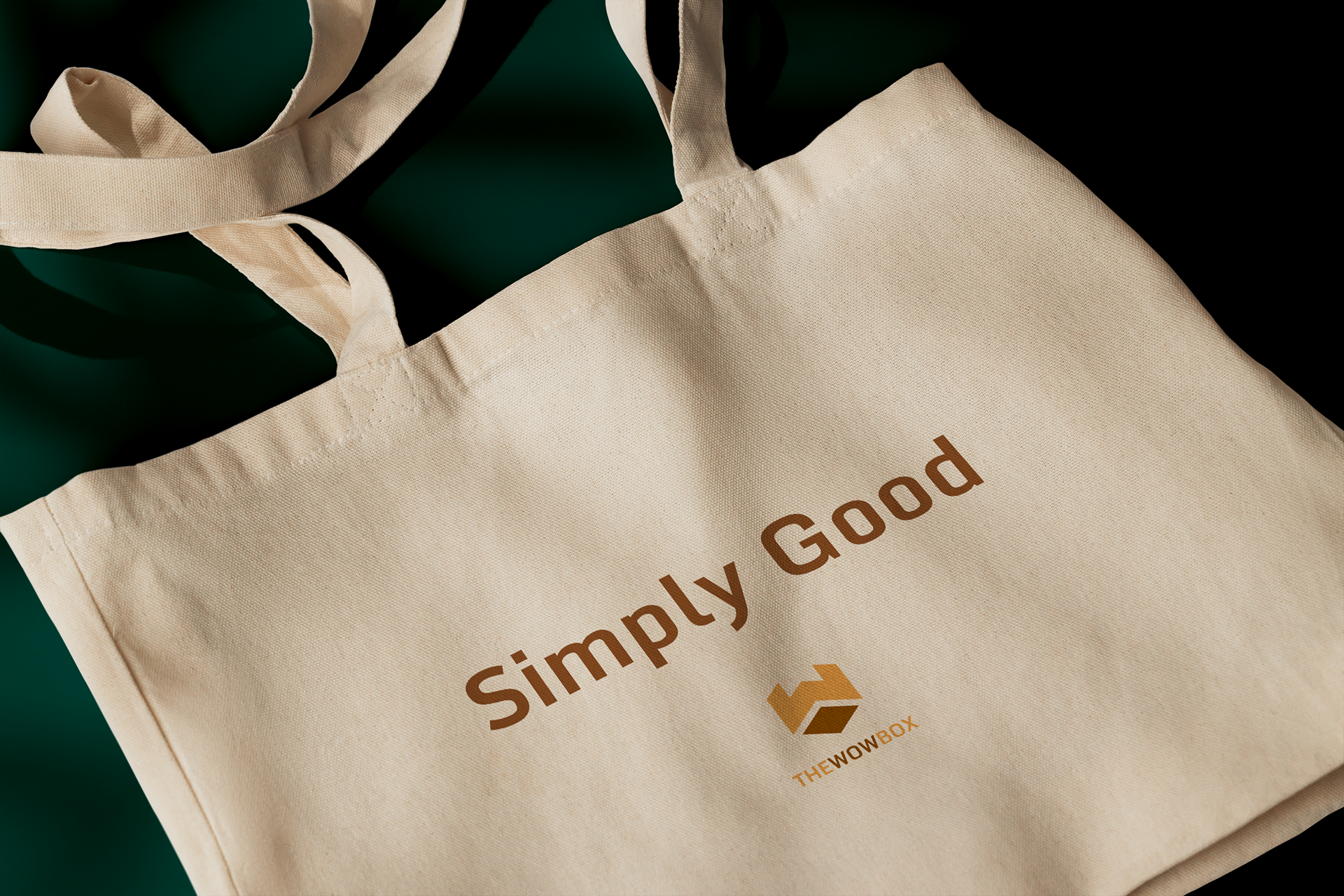
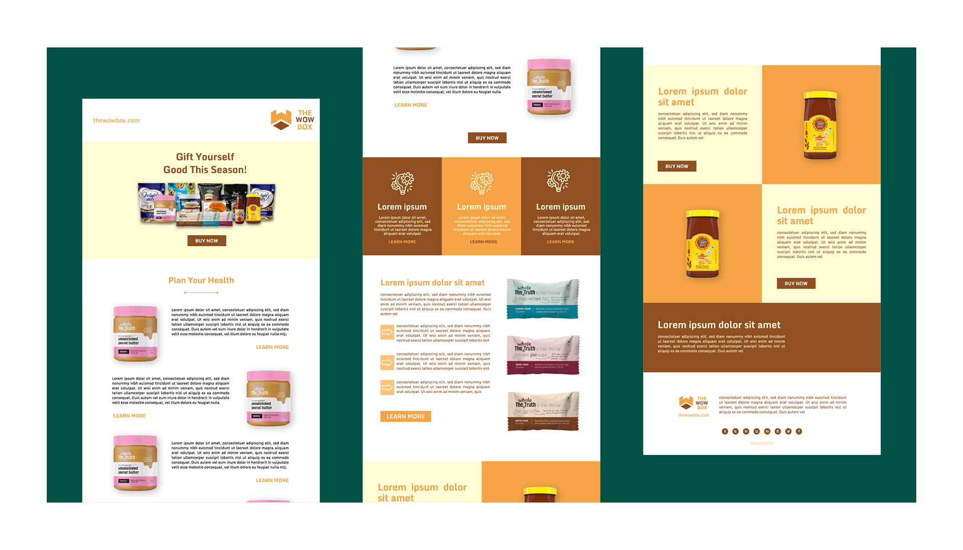
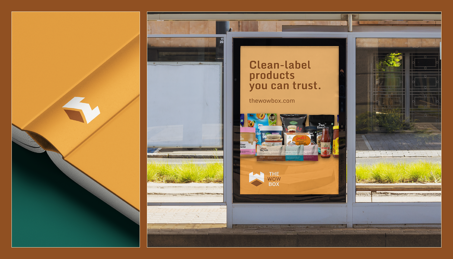
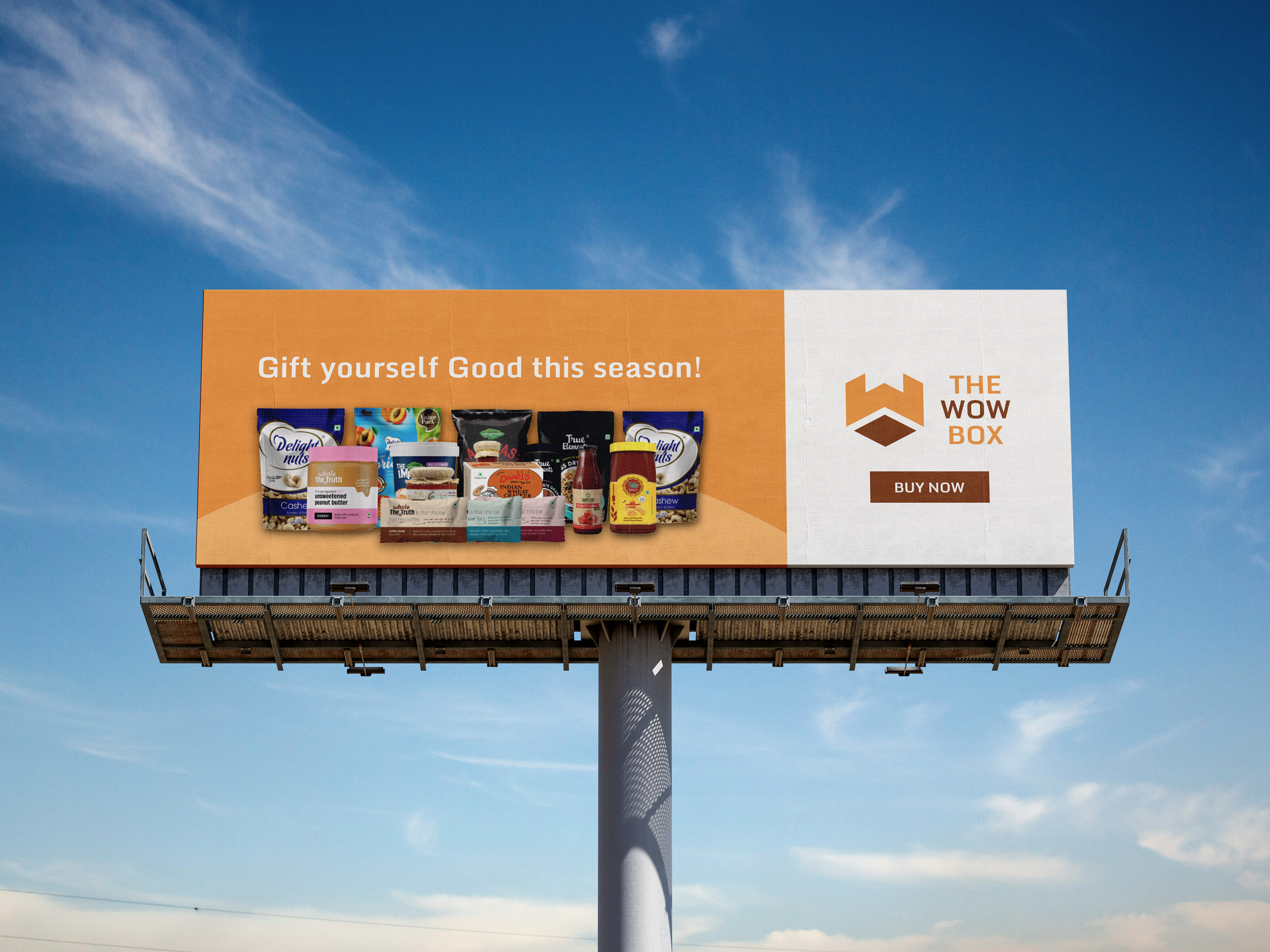
Designing brand applications and mockups across digital and physical touchpoints
Creating layouts for packaging, stationery, social media, website, and marketing communication
Ensuring consistency across all brand materials
Presenting the brand identity in a clear and professional portfolio format
Overall, my role was to build a modern and consistent brand system that helps The WOW Box look credible, approachable, and memorable while communicating its promise of curated, clean-label, good-for-you products.