Company Overview
Rucube is a B2C investment platform focused on making financial decisions simpler and more approachable for everyday users. The company helps people understand their investment options, make informed choices, and move toward their financial goals with more clarity and confidence.
In a space that often feels complex and overwhelming, Rucube aims to create a smoother experience by simplifying the way users explore, compare, and act on investment opportunities. The brand is built around trust, ease, guidance, and financial growth.
Rucube is designed for individuals who want to take better control of their money but need a simple and reliable platform to support their investment journey. Its goal is to make investing feel less intimidating and more accessible for modern users.
Problem
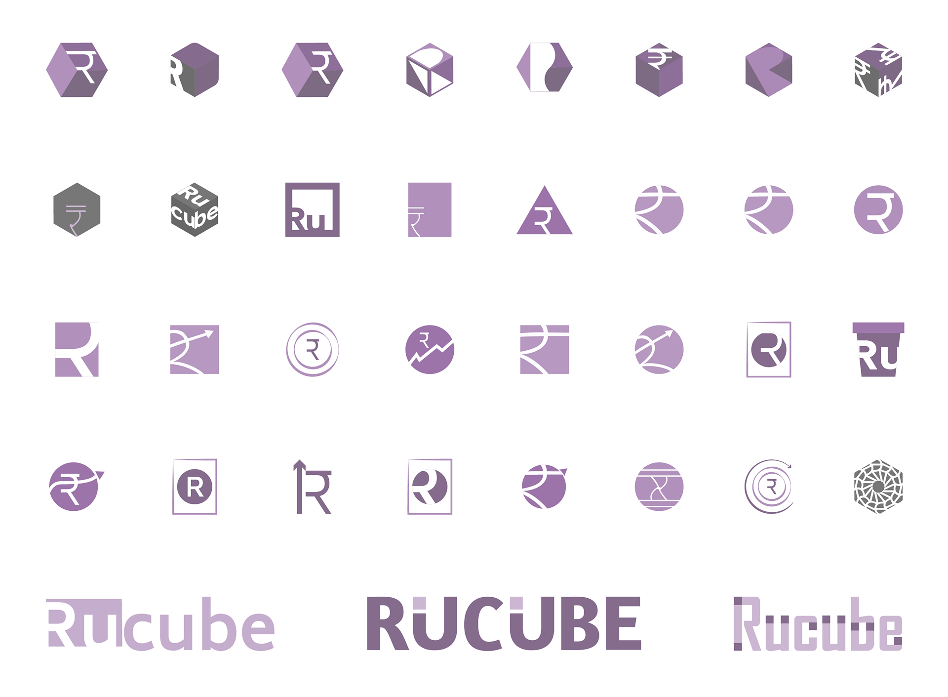
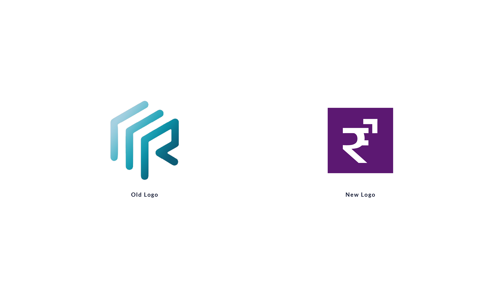
The old logo looked modern, but it did not clearly communicate what Rucube stands for as a consumer-focused financial brand. Its abstract form made it harder for everyday users to quickly connect the logo with money, growth, or financial confidence. For a B2C brand, the identity needed to feel more recognizable, simple, and trustworthy.
Solution
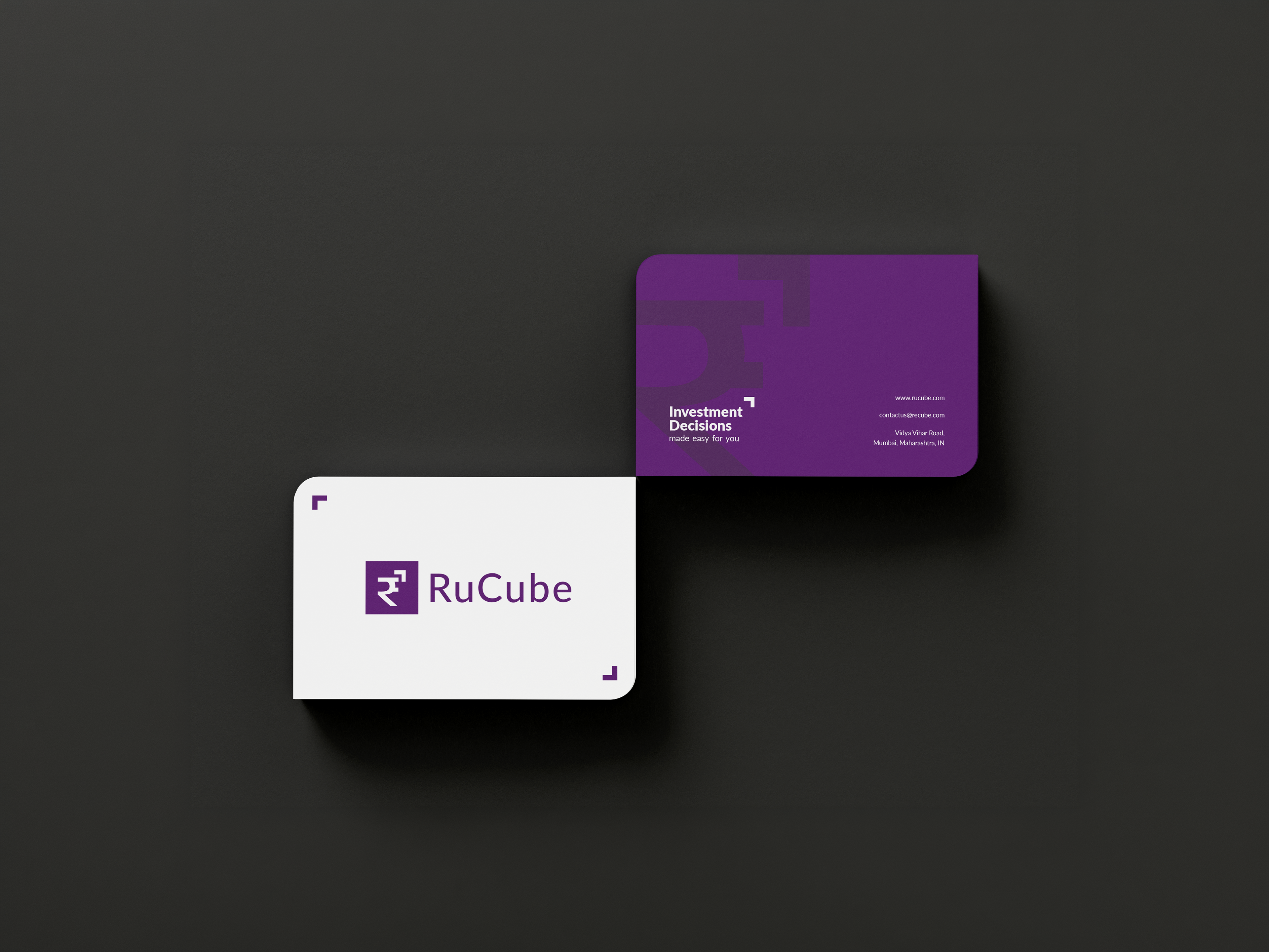
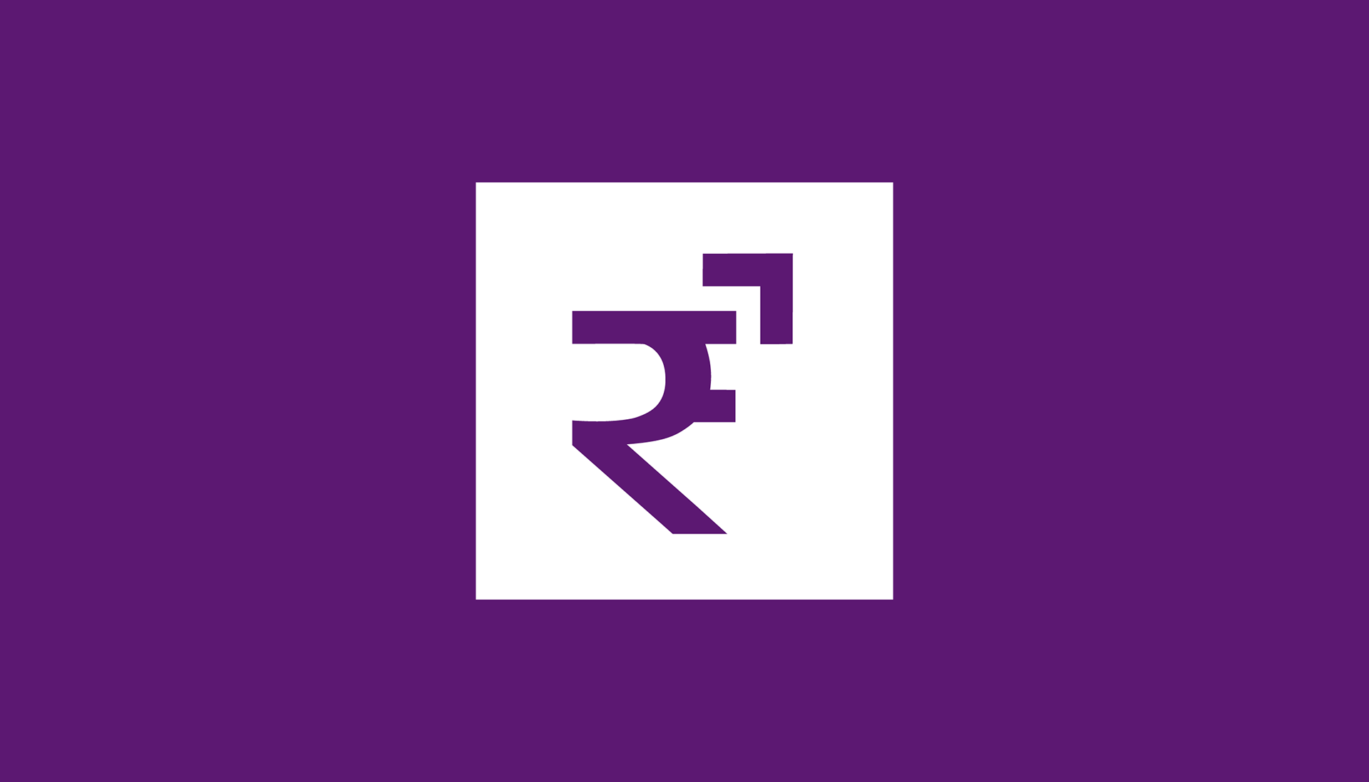
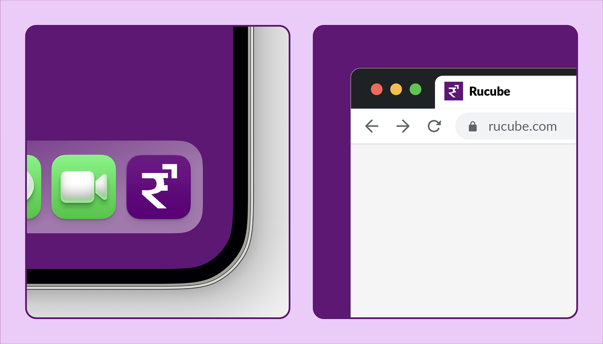
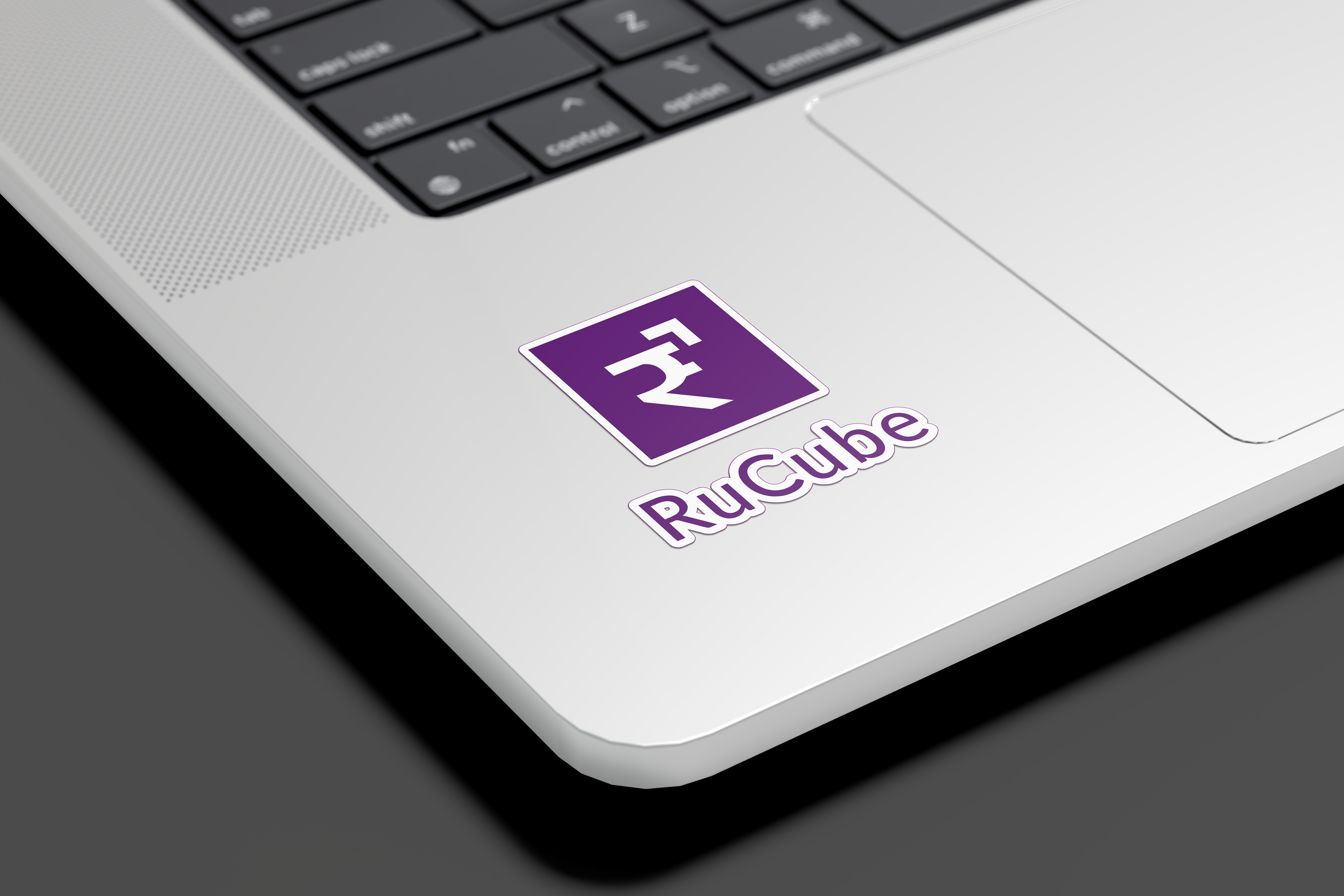
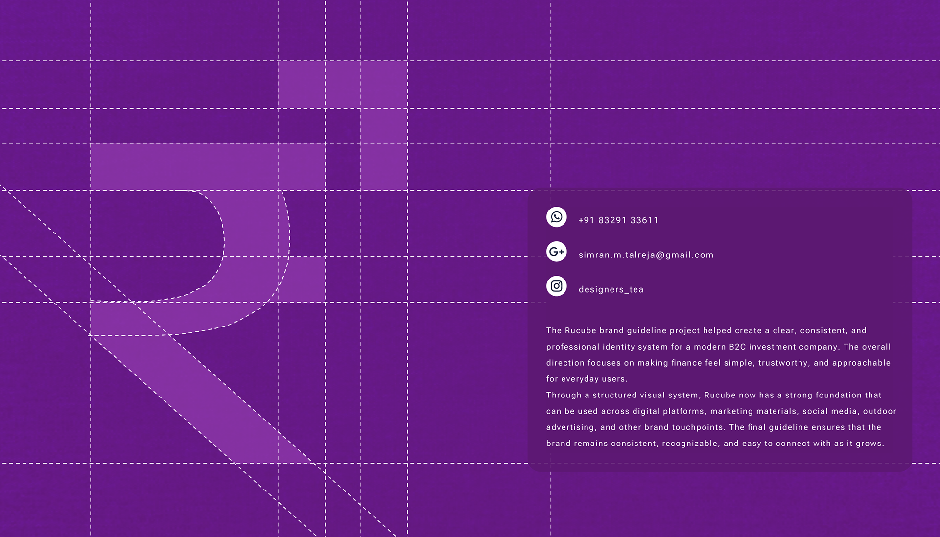
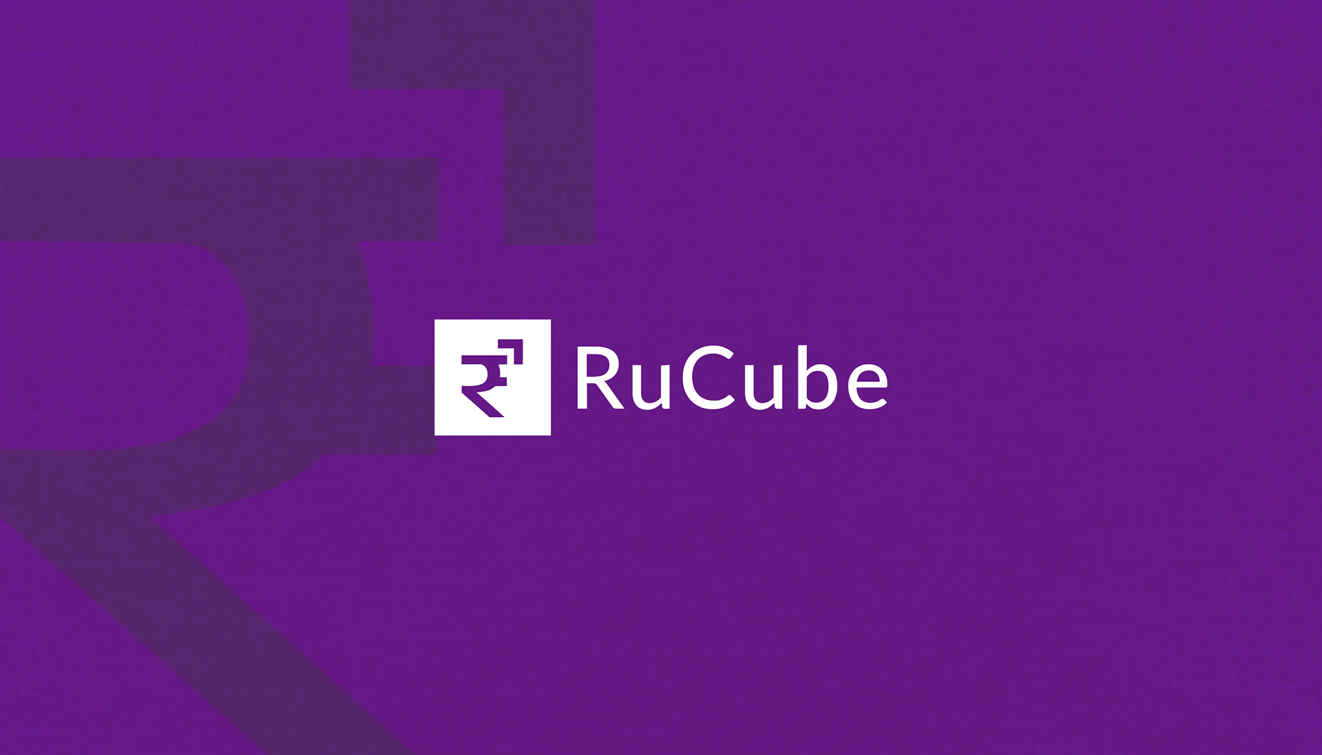
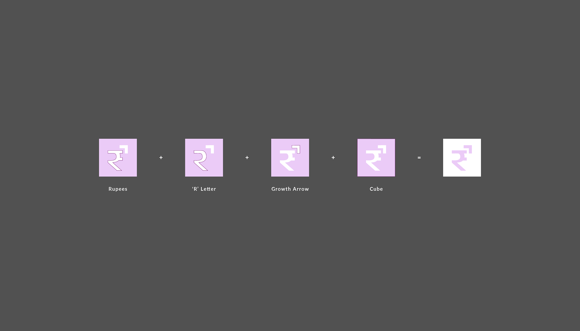
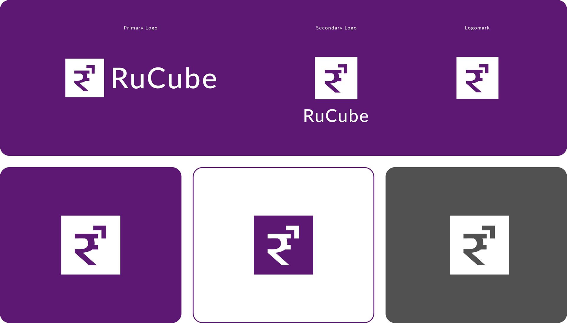
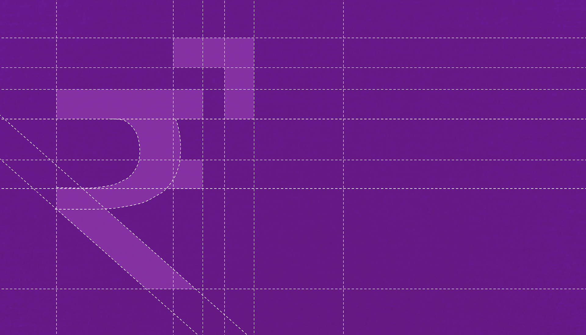
The new Rucube logo creates a clearer and more relatable identity by combining the ₹ symbol, the letter R, a growth arrow, and a cube. The ₹ symbol instantly connects the brand to money and finance, while the hidden R builds brand recall. The upward arrow represents personal growth and financial progress, and the cube adds a sense of stability, security, and structure. Together, the logo feels bold, simple, and easy for customers to remember.
My Role
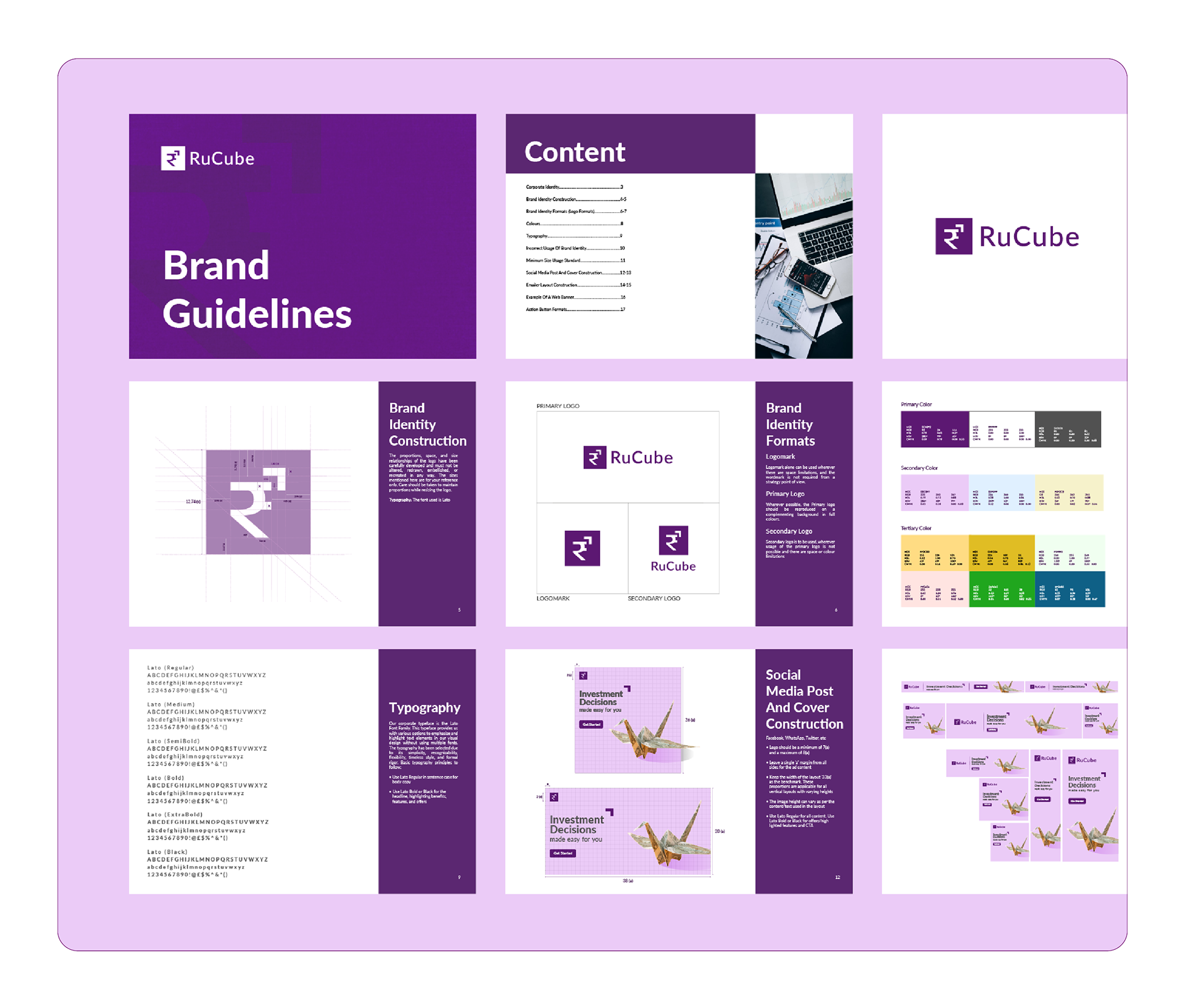
As the designer, my role was to develop a complete brand guideline system for Rucube. I worked on understanding the brand’s purpose, target audience, and positioning as a B2C investment platform, then translated that into a clean and consistent visual identity.
My responsibilities included:
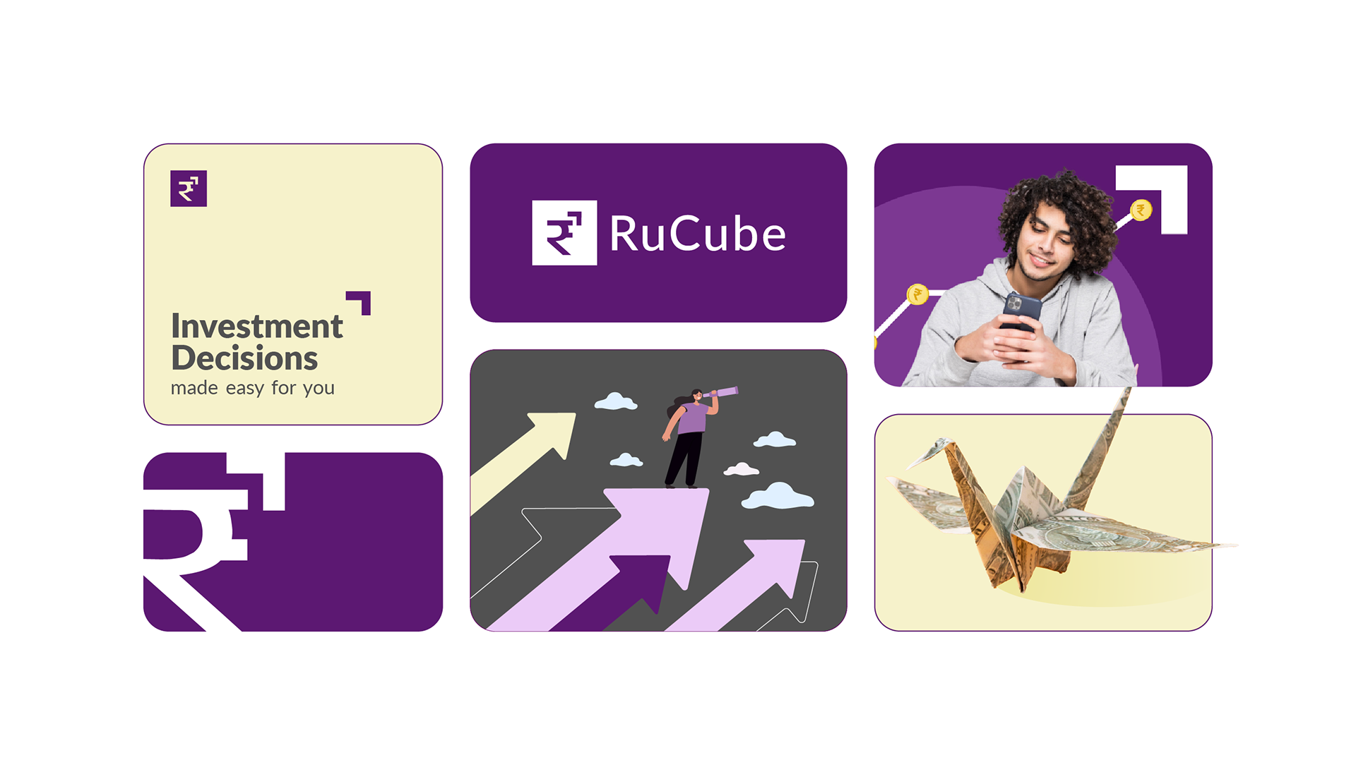
Creating the overall visual direction for the brand
Developing the brand guideline structure
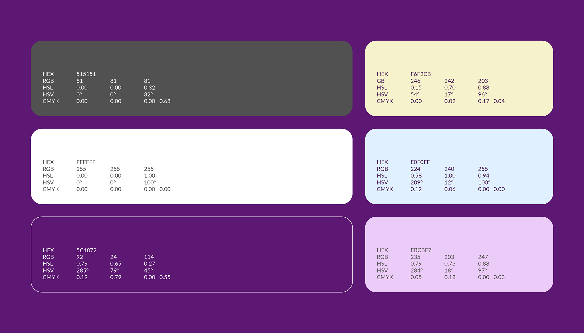
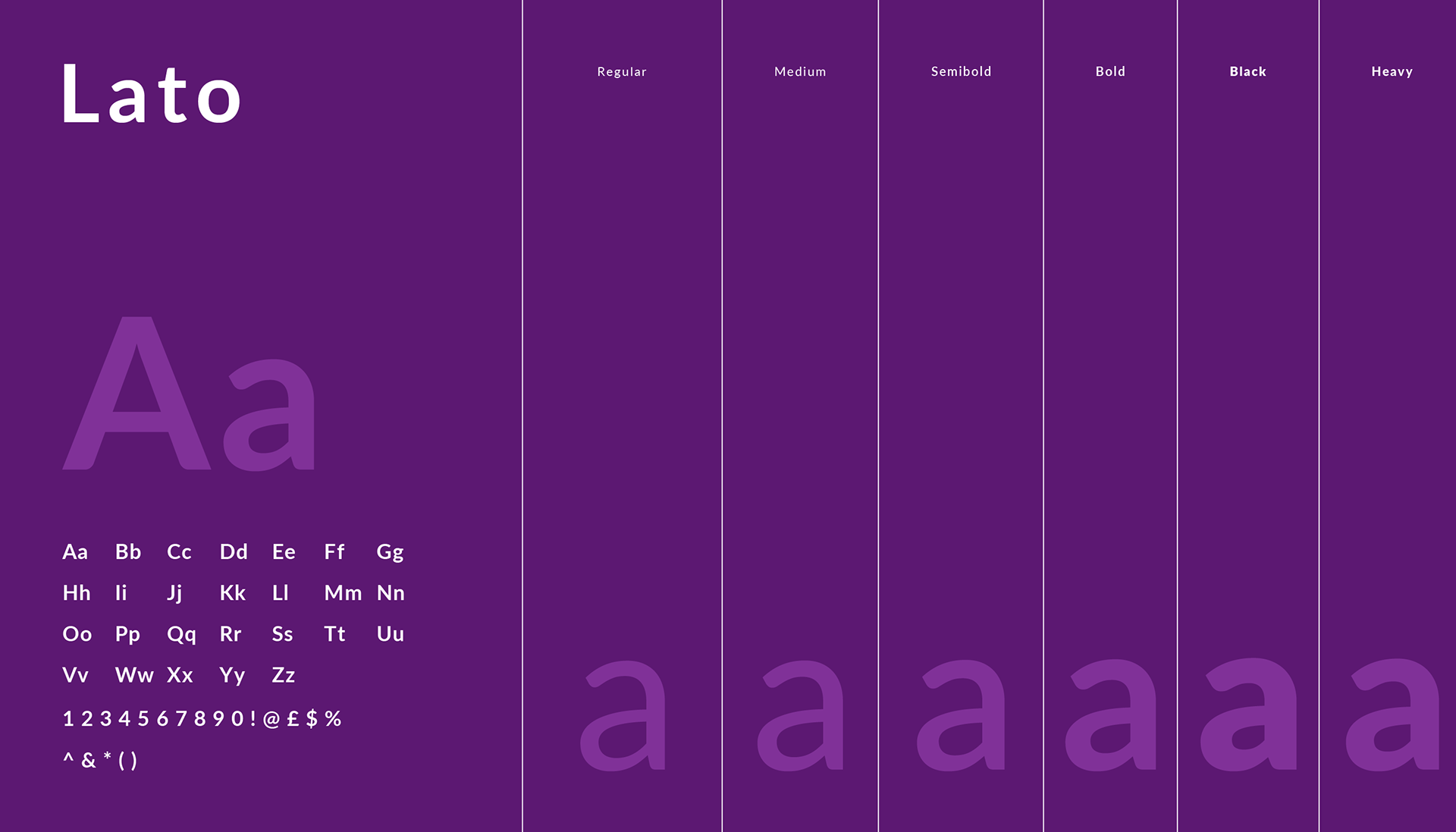
Defining the color palette and typography system
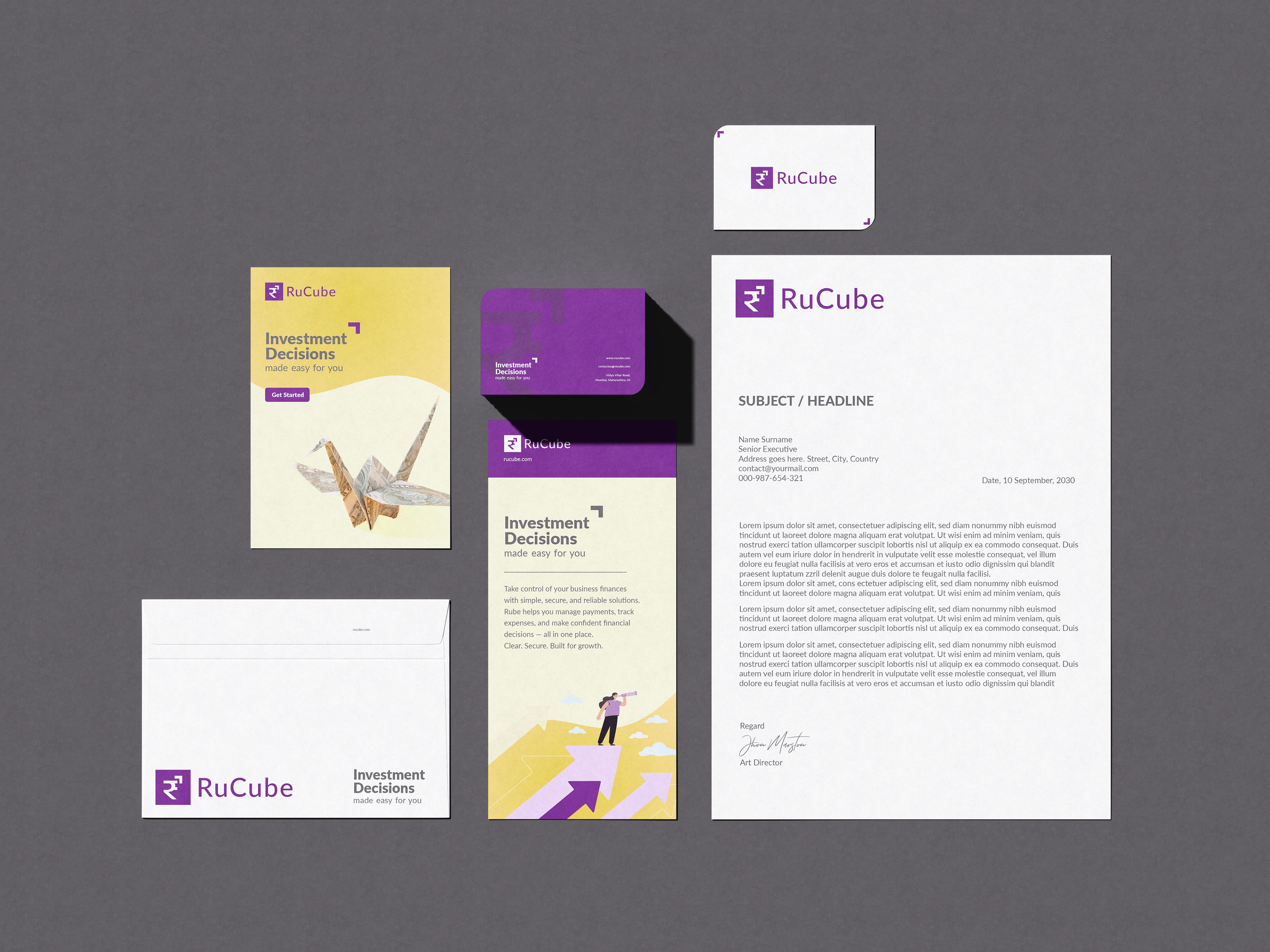
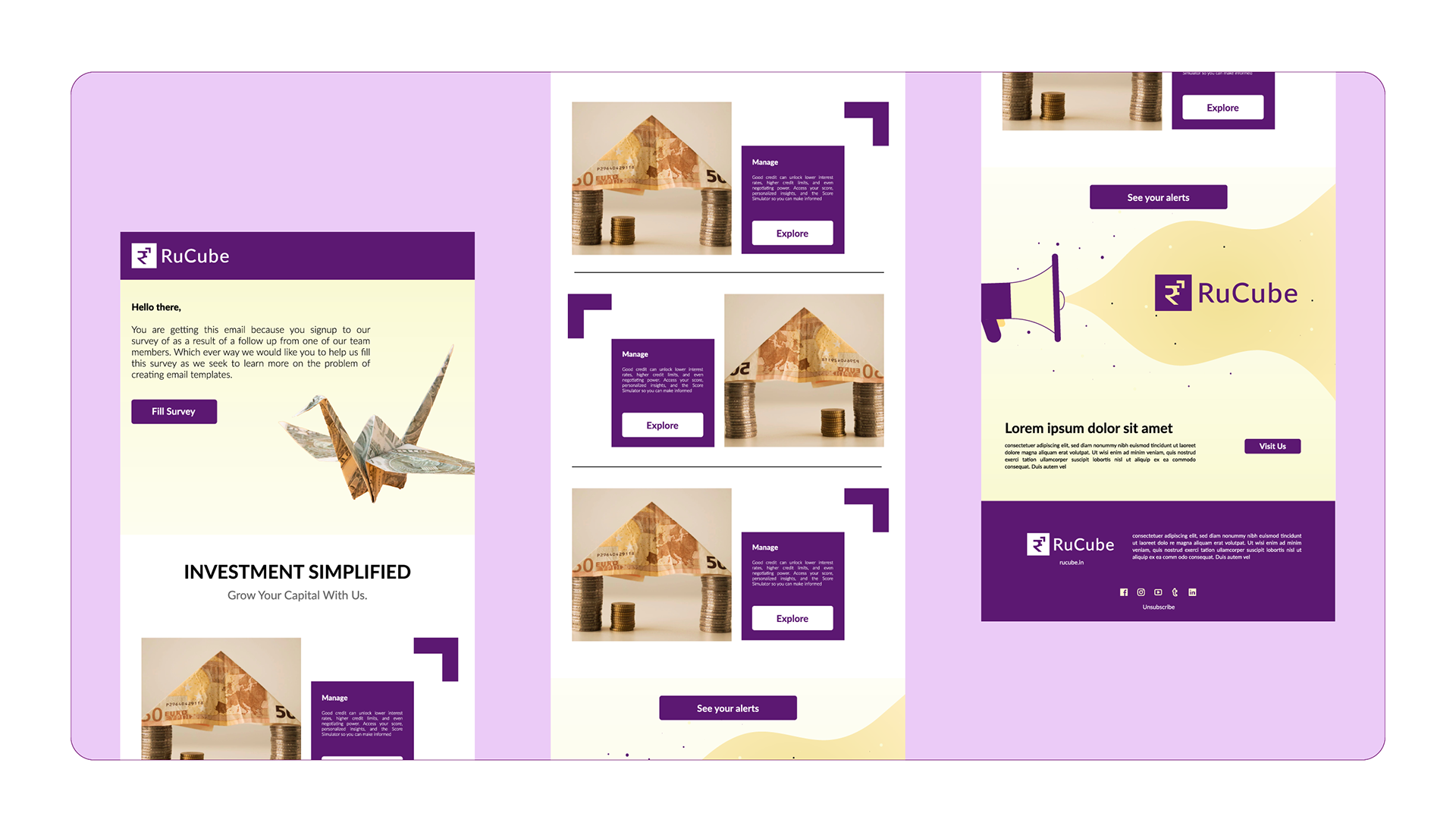
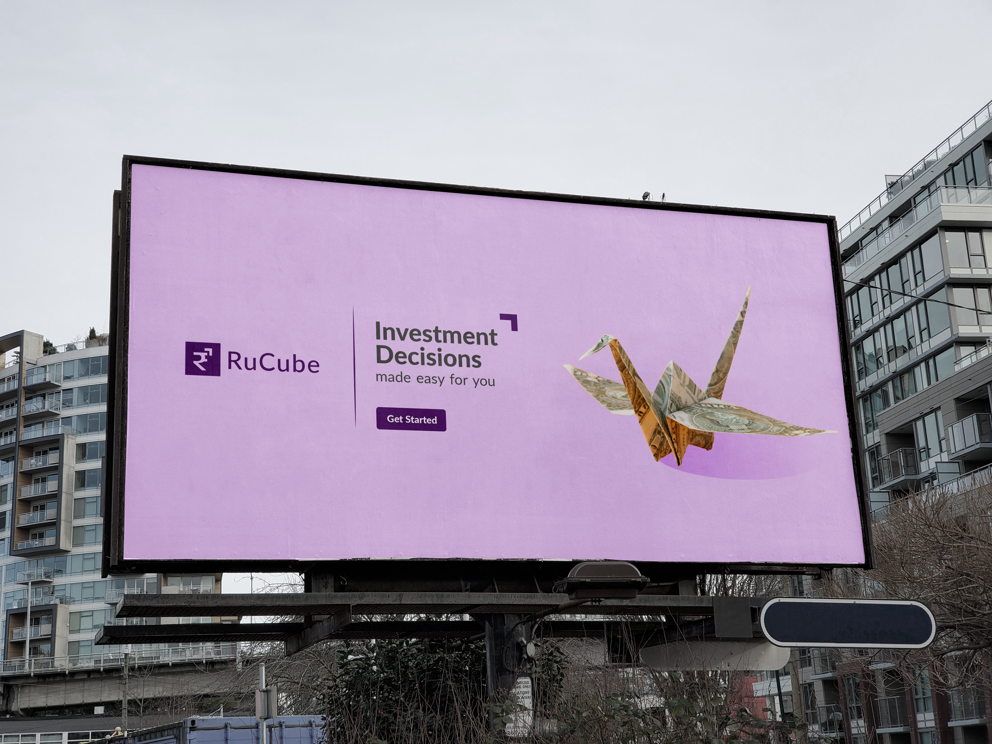
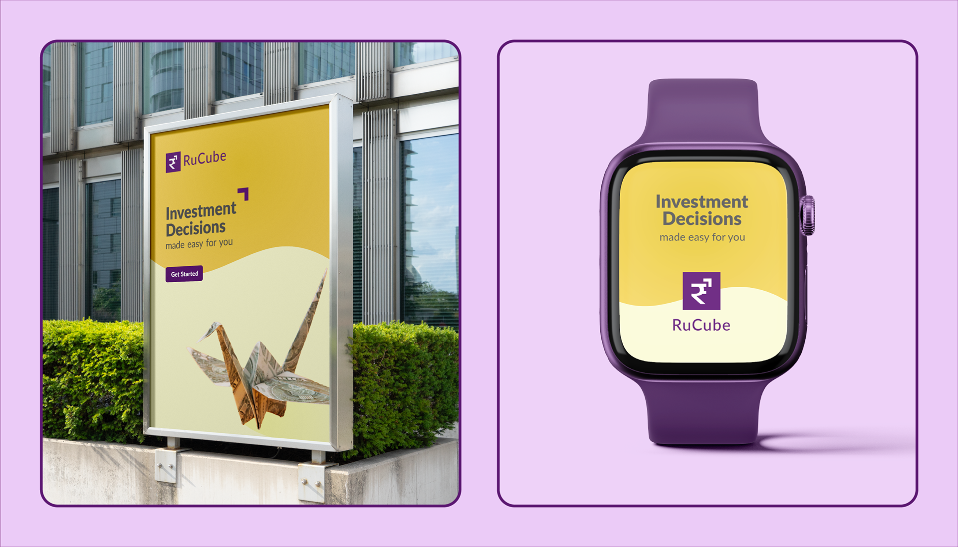
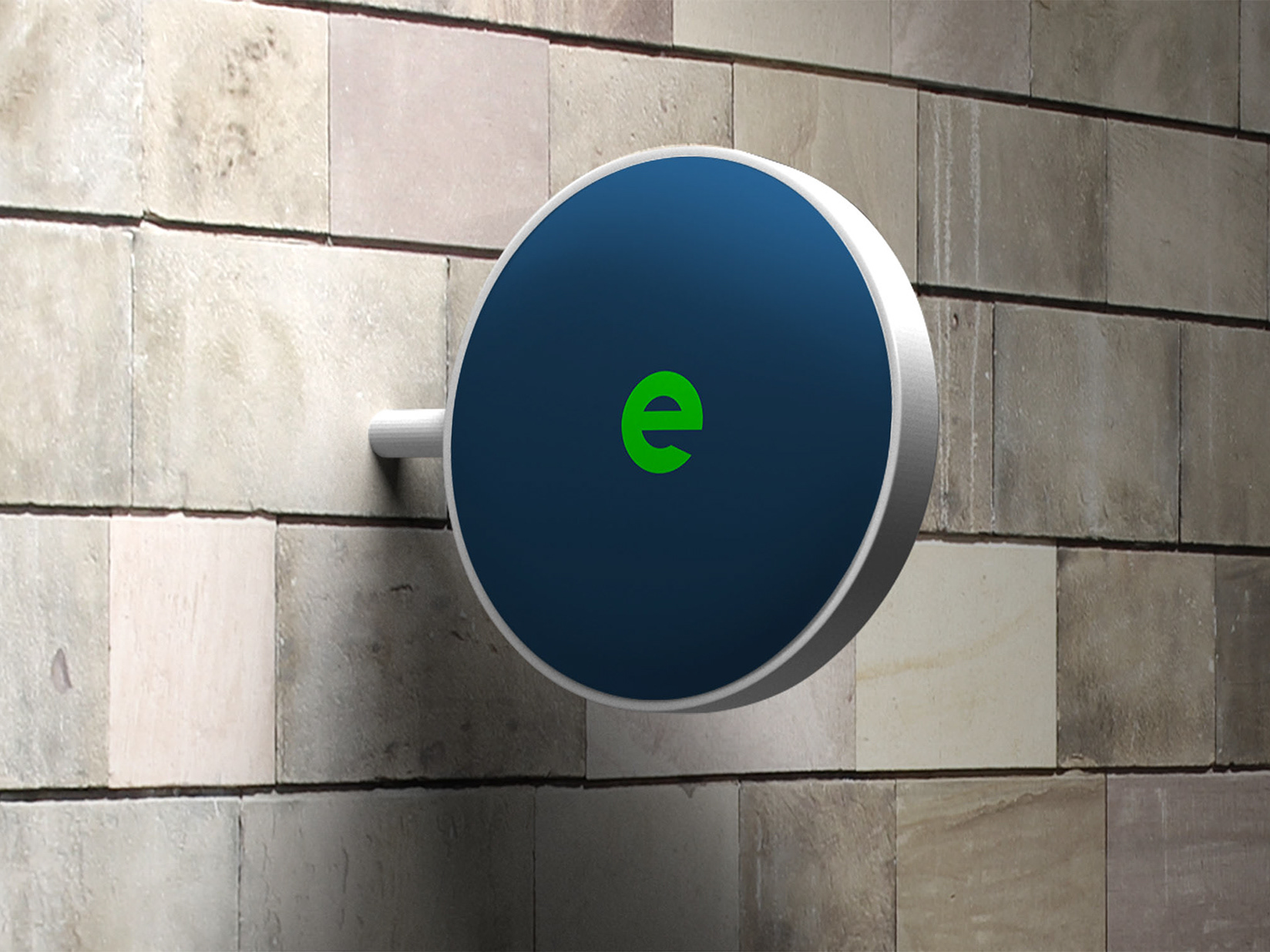
Designing brand applications and mockups
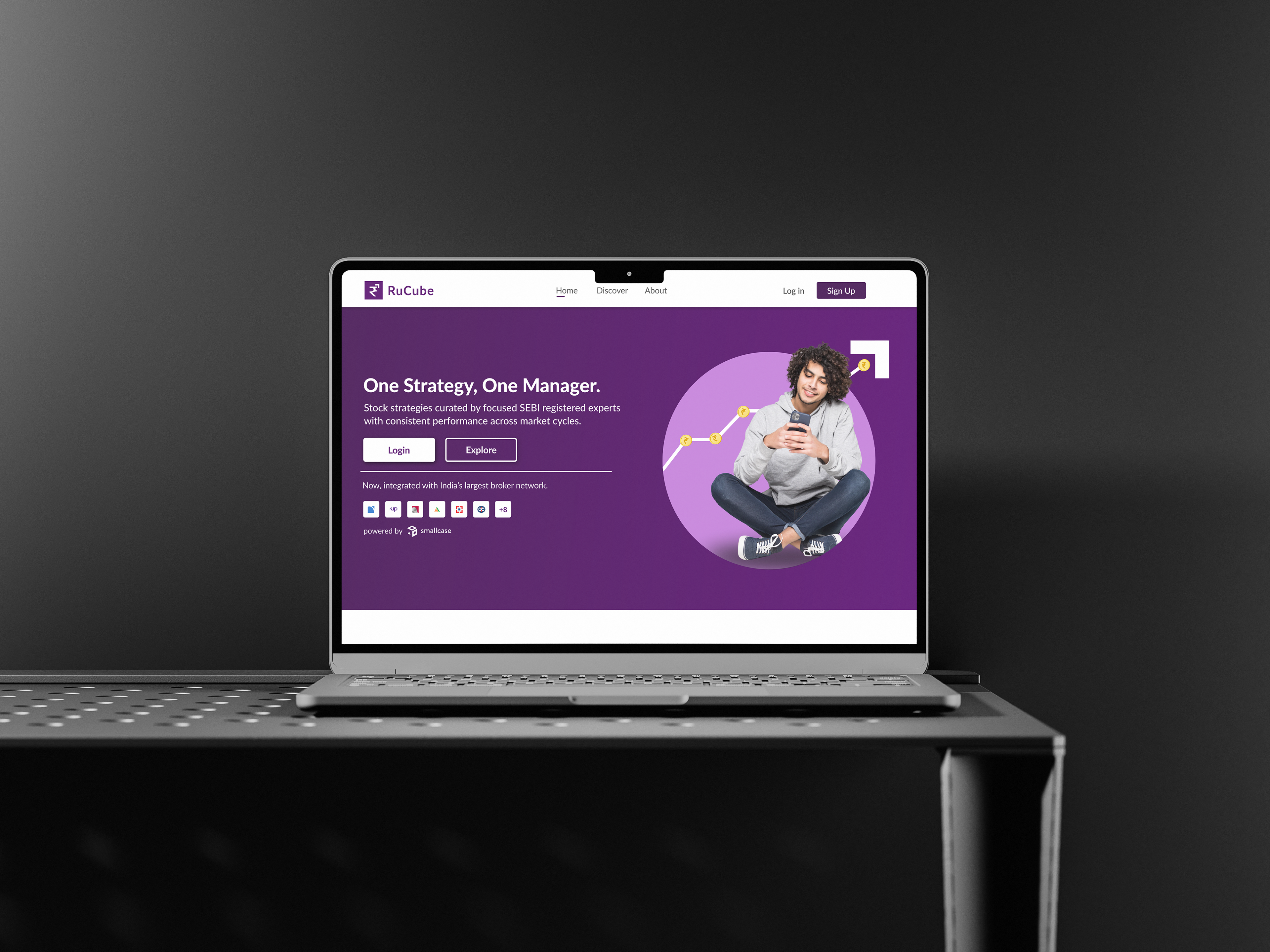
Creating layouts for social media, web banners, outdoor ads, and digital touchpoints
Ensuring consistency across all brand materials
Presenting the brand in a clear and professional portfolio format
Overall, my role was to build a scalable brand system that makes Rucube look trustworthy, modern, and easy for users to understand.